The damning chart which shows why so many public sector workers are striking
Using data from the ONS, the chart shows how much public sector pay has fallen behind that of private sector pay since 2010.

With inflation soaring and the Office for Budget Responsibility predicting that household disposable income will fall by 7 per cent over the next two years – the biggest drop since records began in 1956-57, public sector workers are striking.
The Border Force, nurses, paramedics and postal workers have now joined the railway strikers in demanding better pay and conditions.
The government has thus far refused to negotiate salary increases, using nonsensical claims such as it would lead to a ‘wage-inflation spiral’ to justify its refusal to engage.
A chart produced by BBC Newsnight’s Economics Editor Ben Chu shows the sheer scale of the problem facing public sector workers and just how much wages in both the public and private sector have changed over the last 12 years.
Using data from the ONS, the chart below shows how much public sector pay has fallen behind that of private sector pay since 2010.

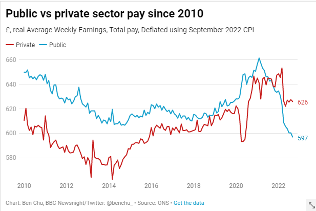
Ben tweeted: “Using inflation-adjusted average weekly earnings, total pay in public sector today is around 5% lower (£597 vs £626), having been 6% higher 12 years ago. Relative to 2010, private sector pay is *up* 2.6%, but public sector pay is *down* 8.15% (though note that with most of the fall happening since February 2021)…
“And, of course, note that 2.6% growth in private sector pay over 12 years is utterly abysmal too, by any standard!…”
Basit Mahmood is editor of Left Foot Forward
Left Foot Forward doesn't have the backing of big business or billionaires. We rely on the kind and generous support of ordinary people like you.
You can support hard-hitting journalism that holds the right to account, provides a forum for debate among progressives, and covers the stories the rest of the media ignore. Donate today.
Donate today