Times slammed for ‘shockingly misleading’ bar chart on Boris Johnson’s popularity
‘The world’s most misleading graph in Today’s Times’
The Times has been slammed for a ‘shockingly misleading’ bar chart, which looked at just how popular Boris Johnson is with Conservative voters.
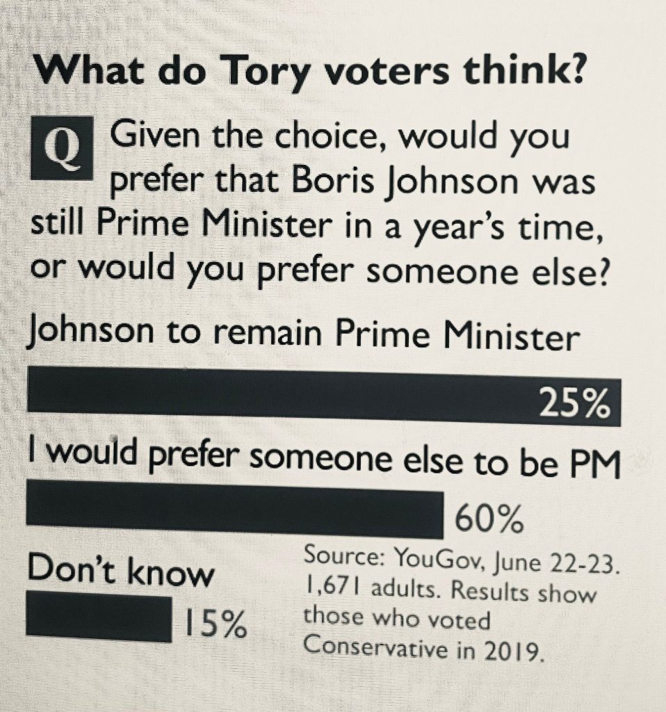
The bar chart is entitled: “What do Tory voters think? Q: Given the choice, would you prefer that Boris Johnson was still prime minister in a year’s time, or would you prefer someone else?
The bar chart below, considering the numbers, is clearly not how you’d visually represent the percentages. Reading the actual figures rather than just the graphic shows just how wrong the Times got it.
The biggest bar is for Johnson to remain prime minister, with just 25% of those asked saying they supported him remaining in power.
However, the next bar is smaller, despite 60% of respondents saying that they would prefer someone else to be PM.
The chart sites as its source a YouGov poll conducted between June 22-23 based on 1,671 adults and adds: ‘Results show those who voted Conservative in 2019.”
The Times received much ridicule online for the chart.
Campaign group Best for Britain called it ‘the world’s most misleading graph in Today’s Times’, while author and scriptwriter John O’Farrell tweeted: “The bar chart in today’s Times shows just how popular Boris Johnson still is with Conservative voters.*
“*if you only look at the graphic and don’t read the actual figures”.
LFF has approached the Times for comment.
Left Foot Forward doesn't have the backing of big business or billionaires. We rely on the kind and generous support of ordinary people like you.
You can support hard-hitting journalism that holds the right to account, provides a forum for debate among progressives, and covers the stories the rest of the media ignore. Donate today.
Donate today