

Place your bets now. In 2026, don’t be surprised if we’re reading headlines about “woke” fonts being purged from Reform-run councils altogether.
Concluding ‘woke-bashing of the week 2025’ with an especially bizarre tale, we head, inevitably, to the United States, and specifically to Secretary of State Marco Rubio, who has dragged typefaces into the right’s war on woke.
Rubio has ordered a halt to the State Department’s official use of Calibri, reversing a 2023 Biden-era directive that he dismisses as a “wasteful” sop to diversity. The new instruction, sent to all diplomats and effective immediately, is the latest move by the Trump administration to dismantle diversity, equity and inclusion (DEI) initiatives.
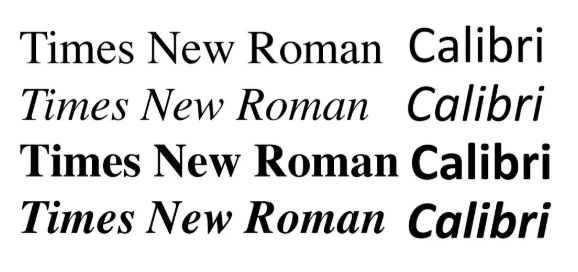
Calibri was the Windows typeface for 17 years and was adopted by the Biden administration for its readability, particularly for people with visual impairments or dyslexia, many of whom rely on assistive technologies such as screen readers.
The change was ordered under then-secretary of state Antony Blinken by the department’s office of diversity and inclusion. With its wider spacing and simpler, sans-serif shapes, which have been described as “soft and modern,” and therefore everything culture warriors despise, the move was welcomed by accessibility and disability advocates.
Enter Rubio. In an “Action Request” seen by the New York Times, he instructed that all official state department paperwork revert to Times New Roman in order to “restore decorum and professionalism to the department’s written work.” Calibri, the memo claimed, is “informal” compared with serif typefaces like Times New Roman and “clashes” with the department’s official letterhead.
And it gets worse.
The subject line of the memo read: “Return to Tradition: Times New Roman 14-Point Font Required for All Department Paper.” Rubio blamed “radical” diversity, equity, inclusion and accessibility programmes for what he described as a misguided and ineffective departure from Times New Roman.
“Switching to Calibri achieved nothing except the degradation of the department’s official correspondence,” Rubio wrote, noting that Times New Roman had been the department’s standard typeface for nearly 20 years before the 2023 change. He even invoked the roots of serif fonts in Roman antiquity, echoing Donald Trump’s enthusiasm for classical styles in federal architecture.
Accessibility advocates were unimpressed. Molly Eagan, CEO of VISIONS, a nonprofit supporting people with visual impairments, told ABC News that font choices are not a trivial matter.
“The State Department’s decision to move away from Calibri may seem minor,” she said, “but for many people with vision impairment (myself included), readability is not a small detail – it’s essential. Calibri and other sans-serif fonts are widely recommended because they are easier to read for people with visual impairments.”
I admit the story made me chuckle. Calibri has always been my preferred font, so perhaps there really is something inherently “woke” about it after all. No wonder they hate it.
One question remains: how long before Reform UK-run councils, currently averaging fewer than 0.5 diversity and equality roles each, decide to issue a similar decree to their own staff.
Place your bets now. In 2026, don’t be surprised if we’re reading headlines about “woke” fonts being purged from Reform-run councils altogether.
Left Foot Forward doesn't have the backing of big business or billionaires. We rely on the kind and generous support of ordinary people like you.
You can support hard-hitting journalism that holds the right to account, provides a forum for debate among progressives, and covers the stories the rest of the media ignore. Donate today.