

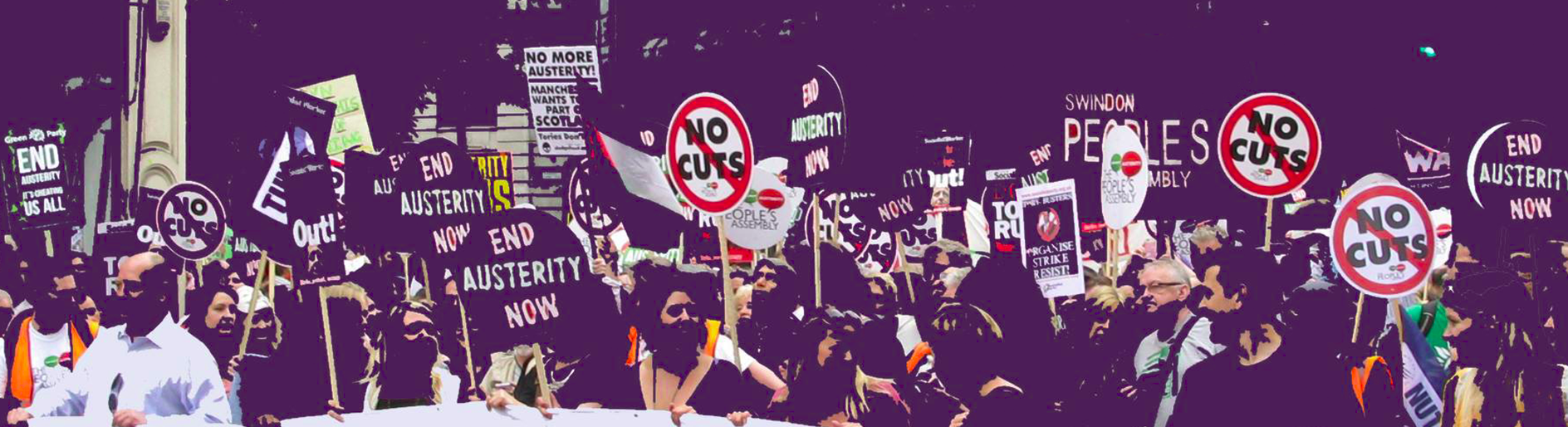
George Osborne's fairness claim torn apart by graph

This distributional graph of the benefit freeze (blue) and personal allowance measures contained in the budget (red) shows how regressive both measures are.
As you can see, changes to welfare his those nearest the bottom (the blue bars on the left), while the personal tax allowance benefits those at the upper end of the income scale (see the red bars on the right).
(Source: IPPR)
As you can see, it was one of the most regressive budgets of recent times.
To reach hundreds of thousands of new readers and to make the biggest impact we can in the next general election, we need to grow our donor base substantially.
That's why in 2024, we are seeking to generate 150 additional regular donors to support Left Foot Forward's work.
We still need another 124 people to donate to hit the target. You can help. Donate today.
21 Responses to “George Osborne’s fairness claim torn apart by graph”
Ash
You have nothing to apologise for Anthony, and it has been my pleasure to encounter such a model of civility online where one least expects it!
Ash
You have nothing to apologise for Anthony, and it has been my pleasure to encounter such a model of civility online where one least expects it!
Ash
You have nothing to apologise for Anthony, and it has been my pleasure to encounter such a model of civility online where one least expects it!
Ash
You have nothing to apologise for Anthony, and it has been my pleasure to encounter such a model of civility online where one least expects it!
Ash
You have nothing to apologise for Anthony, and it has been my pleasure to encounter such a model of civility online where one least expects it!